Homework 4
Problem
Understanding the problem
ggplot(data = mpg, aes(x=cyl, y=hwy)) + geom_point()
This code creates a scatterplot of highway mileage (hwy) versus the number of cylinders (cyl) using the mpg dataset. Each point represents a car model. However, the resultl ikely does not align with the information we aim to convey due to limitations with categorical x-axis data, as we will explore.
Three-Step Framework Analysis
1. Define the Data and Mapping: In this case, the x-axis (cyl) is mapped to the number of cylinders (a categorical variable), and the y-axis (hwy) is mapped to highway mileage. This setup shows a vertical stack of points aat each unique cylinder value (e.g., 4, 6, 8 cylinders).
2. Choose a Geometric Object: The code uses geom_point() to create a scatterplot. Each point represents a single car mode;’s mileage against its cylinder count.
3. Refine with Additional Layers and Aesthetics: There are no additional layers or adjustments here to enhance interpretability.
Critiquing the Visualization
The x-axis variable,
cyl, is categorical, which leads to vertical stacking of points rather than showing a trend distribution. How the fact thatcylis categorical is related with leading a vertical stacking of points rather than a trend distribution?There is no indication of density within each cylinder category, which means the plot does not effectively convey differences in mileage distribution for each cylinder group.
Overlapping points make it difficult to see the density or spread of data points clearly, a problem known as ``overplotting’’.
A Better Alternative Visualization
To better communicate the data, a boxplot would be more effective for categorical data like cyl. A boxplot will show the distribution, median, and range of highway mileage for each cylinder category, making it easier to compare these values.
Ideal Visualization Code
Here is how to make this improved boxplot:
1
2
3
4
5
ggplot(data = mpg, aes(x = factor(cyl), y = hwy)) +
  geom_boxplot() +
  geom_jitter(width = 0.2, alpha = 0.5) +
  labs(x = "Number of Cylinders", y = "Highway Mileage (mpg)", title = "Highway Mileage by Cylinder Count") +
  theme_minimal()
Explanation
geom_boxplot(): This layer plots the boxplot, displaying the distribution of highway mileage within each cylinder category.geom_jitter(): This adds a slight horizontal ``jitter’’ to each point, spreading them out within each cylinder category. Jittering helps visualize points density without overlap.labs(): Adds descriptive axis labels and a title.theme_minimal(): This theme makes the plot cleaner and less cluttered.
Another suggestion for visualization
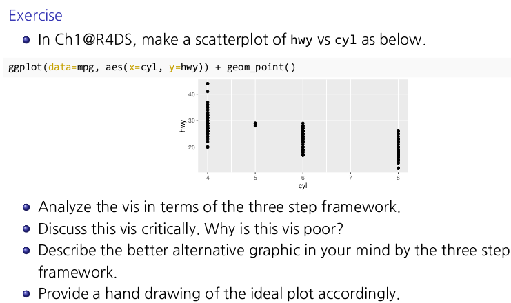
1. Faceted Scatterplot
Faceting creates multiple subplots for each cylinder category (cyl). This allows each category to have its own plot, reducing vertical stacking and making it easier to observe the distribution of hwy values within each cylinder group.
1
2
3
4
5
ggplot(data = mpg, aes(x = hwy, y = displ)) +
  geom_point() +
  facet_wrap(~ cyl) +
  labs(x = "Highway Mileage (mpg)", y = "Engine Displacement (liters)", title = "Highway Mileage by Cylinder Count") +
  theme_minimal()
Explanation
facet_wrap(~ cyl): creates separate scatterplots for each uniquecylvalue.- This approach gives each cylinder group its own space, helping to avoid overplotting and making it easier to interpret differences in
hwyvalues.
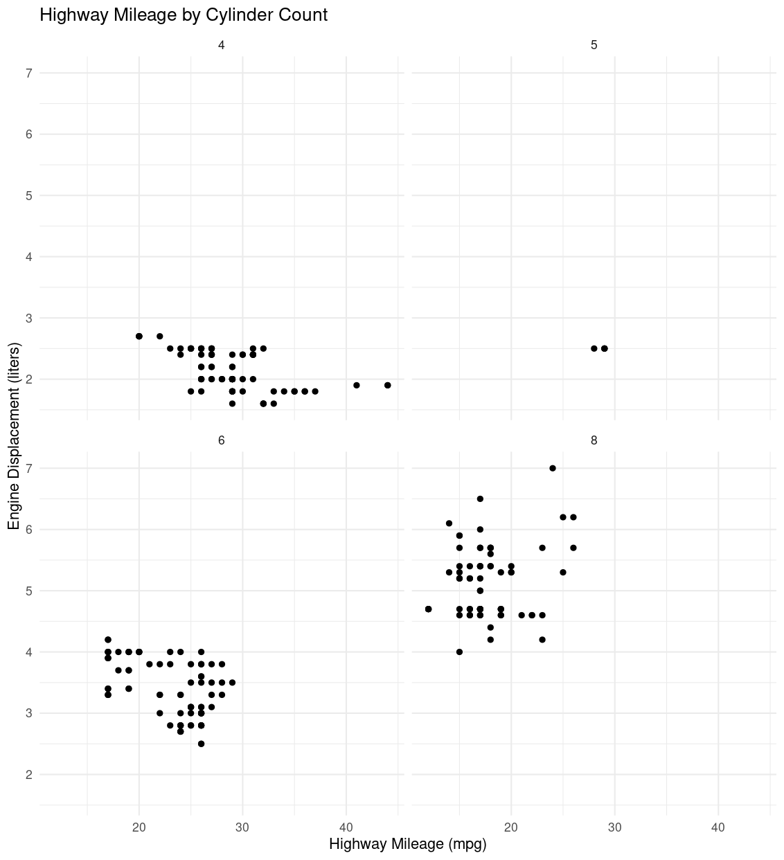
2. Jittered Scatterplot with Transparency
Adding jitter and adjusting transparency directly addresses the issue of vertical stacking and overlapping points, while still using a scatterplot. This technique was mentioned in Chapter 1 for handling overplotting issues.
1
2
3
4
ggplot(data = mpg, aes(x = factor(cyl), y = hwy)) +
  geom_jitter(width = 0.2, alpha = 0.5) +
  labs(x = "Number of Cylinders", y = "Highway Mileage (mpg)", title = "Highway Mileage by Cylinder Count with Jitter") +
  theme_minimal()
Explanation
geom_jitter(width=0.2, alpha=0.5): jitter spreads the points horizontally within each cylinder group, and settingalpha=0.5adds transparency, making it easier to see areas with high point density.this approach is ideal if you want to keep a simple scatterplot but make it more informative by reducing point overlap.
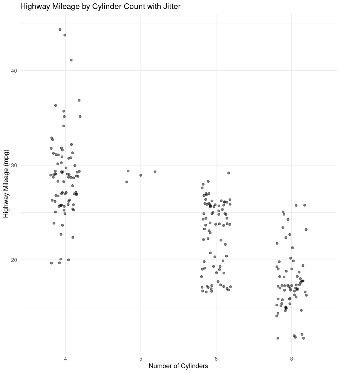
3. Histogram with Facets
A faceted histogram allows us to explore the distribution of hwy within each cyl category by creating a histogram for each unique cyl value. While histograms are not explicitly scatter-based, they are useful for showing distribution within each category.
1
2
3
4
5
ggplot(data = mpg, aes(x = hwy)) +
  geom_histogram(binwidth = 2, fill = "lightblue", color = "black") +
  facet_wrap(~ cyl) +
  labs(x = "Highway Mileage (mpg)", y = "Count", title = "Distribution of Highway Mileage by Cylinder Count") +
  theme_minimal()
Explanation
facet_wrap(~ cyl): creates a separate histograms for each cylinder value.- This visualization helps in understanding how
hwyis distributed across each cylinder group, making it easy to compare central tendencies and spreads without overlapping points.